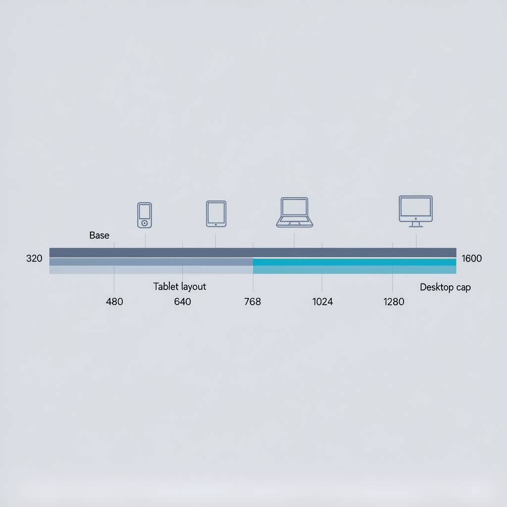
Visual map of common breakpoint ranges for a modern responsive layout
CSS media query breakpoints: 9 Powerful Best Practices
By Morne de Heer · Published by Brand Nexus Studios
You can build a fast, flexible layout without guesswork when you master CSS media query breakpoints. In this guide we turn CSS media query breakpoints into a repeatable playbook you can ship today.
Here is the promise. With a small set of smart CSS media query breakpoints, your UI adapts cleanly from small phones to ultrawide monitors, your CSS stays maintainable, and Core Web Vitals improve instead of slipping.
We will cover the fundamentals, nine powerful best practices, common breakpoint ranges that work now, container queries, performance tactics, accessibility switches, debugging tricks, and a step by step method to choose CSS media query breakpoints that hold up in production.
CSS media query breakpoints fundamentals
Let us start with the basics. CSS media query breakpoints are conditional rules that change styles when the viewport or environment passes a threshold. They are not tied to a specific device. They are tied to places where your content or layout actually breaks.
The most common shape for CSS media query breakpoints uses min-width and a mobile first cascade. You write base styles for the smallest screens, then layer enhancements as the viewport grows.
/* 1. Base styles for all screens */
.card {
  display: grid;
  gap: 1rem;
}

/* 2. Mobile first with min-width */
@media (min-width: 480px) {
  .card {
    grid-template-columns: 1fr 1fr;
  }
}

@media (min-width: 768px) {
  .card {
    grid-template-columns: 1fr 1fr 1fr;
  }
}
Why min-width for CSS media query breakpoints? Because the cascade stays predictable. You add capabilities as space increases, rather than overriding complex desktop rules on tiny screens.
9 best practices for CSS media query breakpoints
These are the habits that keep CSS media query breakpoints clean, fast, and future proof.
1) Let content set your CSS media query breakpoints
First, stop chasing devices. Instead, resize your browser slowly and watch where the UI fails. Those are your CSS media query breakpoints. You might spot a headline that wraps awkwardly or a card grid that jumps from 2 to 3 columns too late. Capture those widths, then round them to clean numbers.
Here is a quick workflow. Build the base layout with no queries, then add CSS media query breakpoints only when something breaks. Your set will likely be smaller and more stable.
2) Prefer min-width for a mobile first cascade
Mobile first keeps specificity low and intent obvious. Write the default for small screens, then enhance with min-width CSS media query breakpoints. This pattern keeps overrides minimal and makes diff reviews easy.
:root {
  --bp-xxs: 360px;
  --bp-xs: 480px;
  --bp-sm: 640px;
  --bp-md: 768px;
  --bp-lg: 1024px;
  --bp-xl: 1280px;
}

.container { padding: 1rem; }

@media (min-width: 480px) { .container { padding: 1.25rem; } }
@media (min-width: 768px) { .container { padding: 1.5rem; } }
@media (min-width: 1024px) { .container { padding: 2rem; } }
If you inherit a desktop first codebase full of max-width CSS media query breakpoints, consider flipping the approach gradually. Start with isolated components to avoid regressions.
3) Keep the set small and meaningful
You rarely need more than 3 to 5 CSS media query breakpoints for pages, plus a few component level adjustments. Extra breakpoints add cognitive load and bloat. Consolidate nearby edges to one clean value like 768.
As a rule, every breakpoint should have a short reason you can defend. If you cannot explain why a breakpoint exists beyond a device name, it probably should not exist.
4) Use fluid type and spacing to reduce breakpoints
Fluid scaling smooths transitions so you need fewer CSS media query breakpoints. Combine clamp with viewport units and rems to create type that grows gently between edges.
html { font-size: 100%; } /* 16px base */
:root {
  --step-0: clamp(1rem, 0.9rem + 0.8vw, 1.25rem);
  --step-1: clamp(1.25rem, 1.1rem + 1.2vw, 1.75rem);
  --space: clamp(1rem, 0.75rem + 0.7vw, 1.5rem);
}
h1 { font-size: var(--step-1); line-height: 1.2; }
p  { font-size: var(--step-0); margin-bottom: var(--space); }
The result is a UI that adapts continuously. You will still use CSS media query breakpoints for structural shifts, but far less often.
5) Reach for container queries for components
Sometimes the viewport lies. A sidebar may reduce a card to a narrow column on desktop. Container queries solve this. Instead of viewport based CSS media query breakpoints, the component adapts to its own container size.
/* Set a containment context */
.card-grid { container-type: inline-size; }

/* Container queries for the component */
@container (min-width: 420px) {
  .card-grid { grid-template-columns: repeat(2, 1fr); }
}
@container (min-width: 720px) {
  .card-grid { grid-template-columns: repeat(3, 1fr); }
}
Use container queries alongside CSS media query breakpoints. The page evolves with the viewport, and each component evolves with its box. This decoupling keeps systems stable.

6) Build layouts with Grid and Flex
Grid and Flex reduce how often you need CSS media query breakpoints. Let Grid auto place tracks and use minmax so the layout stretches gracefully between edges.
.grid {
  display: grid;
  grid-template-columns: repeat(auto-fit, minmax(16rem, 1fr));
  gap: 1rem;
}
Auto-fit with minmax creates a responsive grid with no CSS media query breakpoints at all for many cases. Add a single breakpoint if you want to cap the maximum column width on large screens.

7) Optimize images and art direction
Images are heavy, so pair responsive images with CSS media query breakpoints in your layout. Use sizes and srcset for automatic selection, then art direct when the crop must change.
<img
  src="/images/hero-800.jpg"
  srcset="/images/hero-480.jpg 480w,
          /images/hero-800.jpg 800w,
          /images/hero-1200.jpg 1200w"
  sizes="(min-width: 1024px) 1200px, (min-width: 768px) 800px, 100vw"
  alt="Hero product in two lighting setups"
  loading="lazy" decoding="async" />
Compress images, prefer modern formats like AVIF or WebP, and cache them aggressively. Mention image compression and caching in your performance checklist so you never forget. We compress all images in this post for better page speed.
8) Respect user preference media features
Media queries are not only about width. Use prefers-reduced-motion, prefers-color-scheme, forced-colors, hover, and pointer to enhance comfort and control. These are CSS media query breakpoints for human context, not pixels.
@media (prefers-reduced-motion: reduce) {
  * { animation-duration: 0.001ms; animation-iteration-count: 1; }
}

@media (prefers-color-scheme: dark) {
  :root { color-scheme: dark; }
  body { background: #0b0b0c; color: #eee; }
}

@media (hover: hover) and (pointer: fine) {
  .button:hover { transform: translateY(-2px); }
}
9) Measure, test, and document
Finally, treat CSS media query breakpoints as a small product. Document tokens, test across boundaries, and track impact on Core Web Vitals like LCP, CLS, and INP. Avoid regressions by watching the breakpoints where changes land.
When the stakes are high, an audit plus a refactor can lift conversion and stability. If you need a hand turning messy CSS media query breakpoints into a clean system, website design and development expertise can make the transition safe and fast.
Practical breakpoint ranges that work in 2025
You will derive your own edges from content, but these ranges are a reliable starting point for CSS media query breakpoints on many sites.
- 360 to 479: default mobile base with single column content.
- 480 to 639: small phones in landscape or larger phones portrait. Introduce small layout enhancements.
- 640 to 767: large phones and compact tablets. Cards might go to 2 columns.
- 768 to 1023: tablets and small laptops. Navigation layout can spread out.
- 1024 to 1279: standard laptop widths. Grids can expand to 3 or 4 columns.
- 1280 to 1535: desktops. Constrain line length and cap content width for readability.
- 1536 and up: ultrawide. Add affordances like multi column sidebars or larger gutters.
@media (min-width: 480px)  { /* small enhancements */ }
@media (min-width: 640px)  { /* 2-column cards */ }
@media (min-width: 768px)  { /* tablet layout */ }
@media (min-width: 1024px) { /* laptop layout */ }
@media (min-width: 1280px) { /* desktop layout */ }
Use these as placeholders. Replace them with CSS media query breakpoints you discover from real content and analytics.

Container queries vs CSS media query breakpoints
Viewport based CSS media query breakpoints solve page level shifts. Container queries solve component level shifts. You will likely use both. The trick is deciding which owns which decision.
Use CSS media query breakpoints for navigation patterns, global spacing, and max width caps. Use container queries for cards, media objects, and any component that appears in narrow and wide contexts.
/* Page level decisions by viewport */
@media (min-width: 1024px) {
  .site-header { position: sticky; top: 0; }
  .content { max-width: 72ch; margin-inline: auto; }
}

/* Component decisions by container */
.article { container-type: inline-size; }
@container (min-width: 60ch) {
  .pull-quote { float: right; width: 20ch; }
}
The result is fewer conflicts. Components are less likely to break when moved, and CSS media query breakpoints stay focused on what they do best.
Performance and maintainability tactics
Performance is a feature. CSS that ships fast and executes fast improves business metrics. These steps keep your CSS media query breakpoints lean.
- Ship critical CSS inline for above the fold, then defer the rest.
- Minify and bundle. Avoid duplicate rules across CSS media query breakpoints.
- Use tokens for breakpoints and spacing to reduce errors.
- Adopt a clear naming convention, like BEM or a utility approach.
- Serve images in modern formats. Compress aggressively.
- Use HTTP caching and a CDN. Leverage cache busting with content hashes.
- Enable page caching and smart preloading for routes with heavy images.
If your CSS is tangled, you can refactor in slices. Identify one template, list its CSS media query breakpoints, migrate it to mobile first with tokens, and measure. Repeat for the next template. It is safer than a big bang rewrite.
When the goal includes search growth, remember that clean CSS media query breakpoints support crawl efficiency and engagement. Pair your technical upgrades with focused SEO services so content and performance rise together.
Accessibility with media features that matter
Accessibility is for everyone. Media features let you adapt to user preferences as naturally as you adapt to width. These belong in the same system as your CSS media query breakpoints.
- prefers-reduced-motion: replace big animations with subtle fades.
- prefers-color-scheme: default to system theme and test contrast.
- forced-colors: ensure high contrast mode shows visible focus.
- hover and pointer: enhance hover only when a mouse is present.
- prefers-contrast: support higher contrast if available in the browser.
@media (forced-colors: active) {
  :focus { outline: 2px solid CanvasText; }
}
These choices reduce motion sickness, eye strain, and confusion. Treat them as first class CSS media query breakpoints that improve comfort and conversions.
Debugging and testing CSS media query breakpoints
Testing is not a chore when you make it visual. DevTools can overlay CSS media query breakpoints so you can see when a condition is active. Move the viewport slowly and watch elements lock into place.
- Turn on device toolbar and add your exact CSS media query breakpoints.
- Use a solid outline utility class to reveal overflow and unintended scroll.
- Test RTL and long localized strings across boundaries.
- Simulate prefers-reduced-motion, dark mode, and hover states.
/* Debug helper */
* { outline: 1px solid rgba(0, 128, 255, 0.1); outline-offset: -1px; }
Real world patterns that thrive with CSS media query breakpoints
Navigation that scales
Start with a minimal header. At a tablet sized CSS media query breakpoint, reveal the primary links. At a laptop sized breakpoint, add the search bar and secondary links. Avoid duplicating markup for mobile and desktop menus unless necessary.
Hero sections without layout jumps
Use fluid type and clamp first. Then add one or two CSS media query breakpoints to adjust the media crop and the max width of text. Keep lines around 45 to 75 characters for readability.
Card grids and listings
Auto fit with minmax removes most CSS media query breakpoints. Use a single breakpoint to increase the column cap on large screens. Keep card content short and stable to prevent awkward height mismatches.
Data tables
Tables are hard. Use CSS media query breakpoints to collapse to a stacked layout below 480, show key columns at 640, and show full width at 1024. Add sticky headers to help scanning on tall phones.
Forms that never fight the keyboard
On small screens, avoid two column forms. At the first CSS media query breakpoint, place labels inline. At the next, use two columns for short input pairs like city and postal code.
How to choose CSS media query breakpoints step by step
Here is a fast method you can repeat on any project. It produces CSS media query breakpoints that are easy to maintain and match real user behavior.
- Inventory. List your templates and components. Paste in real content, not lorem.
- Base build. Create the mobile first layout with no CSS media query breakpoints.
- Observe. Drag the viewport very slowly from 280 to 1600. When something breaks, note the width.
- Cluster. Group nearby edges and round to clean numbers like 480, 768, 1024.
- Tokenize. Create custom properties for CSS media query breakpoints and spacing.
- Implement. Add min-width rules in order from small to large. Keep selectors short.
- Validate. Test on devices, including low end Android and high DPI iPhones.
- Document. Add a one line reason for each breakpoint in your README or design system.
:root {
  --bp-1: 480px;  /* label: small enhancements */
  --bp-2: 768px;  /* label: tablet layout */
  --bp-3: 1024px; /* label: laptop layout */
  --bp-4: 1280px; /* label: desktop cap */
}
This approach turns CSS media query breakpoints into a stable contract between design and engineering. Everyone knows why each edge exists.
Maintain a shared language and system
Teams ship faster when they share names and tokens. Put your CSS media query breakpoints in a small tokens file and reference them everywhere. Pair them with spacing, colors, and type scales.
:root {
  --bp-sm: 480px;
  --bp-md: 768px;
  --bp-lg: 1024px;
  --bp-xl: 1280px;

  --gutter: clamp(1rem, 0.5rem + 1vw, 2rem);
  --radius: 0.5rem;
}
Document the set in your repo and your design system. If marketing needs a campaign page next week, a stable base of CSS media query breakpoints means the new layout will look right on day one.
If you need a partner to harden your system and keep it fast, analytics and reporting will help you spot where CSS media query breakpoints need tuning and where users fall off.
Mistakes that cause pain
A few traps create most of the chaos. Avoid these and your CSS media query breakpoints will stay tidy.
- Overfitting to devices. Device catalogs change. Content does not.
- Too many edges. Each one adds maintenance cost and testing time.
- Desktop first everywhere. High specificity and overrides pile up.
- Mixing min and max at the same layer. You will chase bugs across overlaps.
- Ignoring user preferences. Motion and contrast settings matter.
- Uncompressed images. They wipe out your performance wins.
Stay focused on content based CSS media query breakpoints and you will avoid most layout whiplash.
Implementation checklist
Print this out or drop it into your README. It keeps CSS media query breakpoints honest.
- Define 3 to 5 content driven CSS media query breakpoints.
- Use min-width, mobile first. Keep max-width for rare cases.
- Adopt container queries for component layouts.
- Scale type and spacing with clamp to reduce edges.
- Use Grid auto-fit with minmax for flexible lists.
- Compress and cache images. Use srcset and sizes.
- Respect prefers-reduced-motion and color scheme.
- Measure LCP, CLS, INP after big layout changes.
- Document each breakpoint with a one line reason.
If you prefer to move faster with experienced hands on the code, Brand Nexus Studios can help you plan, implement, and test CSS media query breakpoints without disrupting releases.
FAQs
Quick answers to common questions about CSS media query breakpoints.
What is the best first breakpoint?
Start at 480 for small enhancements. It covers many phone landscapes and larger phones. Then validate it against your actual components and adjust.
Are fluid layouts enough without CSS media query breakpoints?
Fluid layouts go far, but structural changes still need edges. Combine fluid type and spacing with a small set of CSS media query breakpoints for the best result.
How do I avoid overlapping rules?
Use strictly increasing min-width CSS media query breakpoints. Keep the order consistent and avoid mixing max-width in the same layer.
What metrics prove my layout improved?
Look for LCP faster on mobile, lower CLS around breakpoint transitions, and higher engagement. Track conversion changes by viewport width.
Should I support ultrawide monitors?
Yes, but cap reading width and add tasteful enhancements like denser grids or larger gutters. Keep edges simple and predictable.
How do I name breakpoints?
Use semantic names like sm, md, lg, xl tied to variables. Do not encode device names. The same names should appear in code and design files.
What about legacy IE or old Android?
Progressive enhancement helps. The base layout should be usable even without modern features. CSS media query breakpoints add enhancements on capable browsers.
References
About the Author