
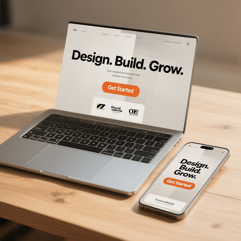
Feature image compressed for fast loading. Strong hierarchy and a focused CTA are the heart of effective landing page design
Landing page design: 27 Proven Tips + Templates
By Morne de Heer, Published by Brand Nexus Studios
If you want predictable conversions, start with landing page design that removes friction and amplifies trust. In the next few minutes, you will get a practical blueprint for landing page design, plus ready to use portfolio templates you can copy today.
We keep it simple. One page, one goal, one clear promise. Follow these steps and you will ship faster, test smarter, and scale results without guesswork or fluff.
Landing page design fundamentals that never change
Great landing page design balances clarity and momentum. Visitors should know where they are, what they get, and why it is safe to act, all within seconds.
Focus on these pillars. They work across niches, devices, and channels, and they are easy to QA on launch day without a designer on call.
- One goal. Do not split attention. Every block should point to the primary CTA.
- Clear value. State the outcome, not the feature. Translate specs into benefits.
- Proof stacked near claims. Pair testimonials, logos, and data with the promise.
- Fast pages. Image compression and caching add real money to your conversion rate.
- Frictionless forms. Fewer fields, fewer doubts, more completions.
- Mobile first. Design for thumbs, short attention, and variable network speed.
- Visible tracking. If you cannot measure it, you cannot improve it.

27 step blueprint for landing page design that converts
You only need to nail a few decisions to make landing page design pay off. Use this checklist and check each item off before you ship.
- Choose a single conversion. Demo, quote, purchase, or email signup. Everything else is optional.
- Define the visitor’s job to be done. Write 3 bullets that capture pains, desired gains, and obstacles.
- Draft a no fluff value proposition. Format it as Outcome in Timeframe without Risk.
- Write 10 headline options. Keep one idea per line. Pick the clearest, not the cutest.
- Pair a subhead with a specific outcome. Clarify what happens if they click your CTA.
- Decide the above the fold layout. Show headline, subhead, hero visual, primary CTA, and one proof element.
- Use a single primary CTA. Repeat it in the hero, mid page, and near the footer.
- Select a hero visual that reinforces value. Avoid generic stock. Show product in use or the after state.
- Stack proof early. Add 3 logos, 1 testimonial, and 1 data point near the claim.
- Clarify the offer in one sentence. Spell out what they get, how fast, and what it costs.
- Design scannable sections. Each block gets a headline, 2 lines of copy, and a visual or icon.
- Kill distractions. Remove header navigation and any secondary buttons that leak attention.
- Reduce form fields. Ask for only what you need to deliver value within 24 hours.
- Use microcopy to reduce anxiety. Add privacy notes and error help under each field.
- Offer a soft conversion. If the main ask is big, add a lead magnet to capture intent.
- Handle objections. Use an FAQ block that answers price, timing, and trust concerns.
- Make the CTA specific. Replace Submit with Get my free audit or Start my 14 day trial.
- Ensure accessible contrast. Meet WCAG color contrast and add focus states.
- Optimize speed. Compress images, minify CSS, defer scripts, and enable caching.
- Set up analytics properly. Mark primary and secondary conversions with clear events.
- Validate on mobile first. Test thumbs, tap targets, and keyboard navigation.
- Run a copy pass aloud. If a sentence feels heavy, cut or split it.
- QA form errors. Trigger every error state and confirm helpful messages appear.
- Ship a v1 quickly. Do not wait for perfect. Perfect is slower than tested.
- Launch A/B tests. Test headline clarity, hero image, and form length first.
- Review heatmaps weekly. Look for rage clicks, dead zones, and missed scroll depth.
- Iterate based on evidence. Keep what moves the needle. Remove what does not.
Run this loop for 2 to 4 weeks and your landing page design will compound gains. Little wins stack into big results.
Copy frameworks that power landing page design
Copy moves the sale. Use frameworks to systemize your landing page design and keep the message tight and compelling.
AIDA for structure
Attention with a bold outcome. Interest with a short story or stat. Desire with proof and benefits. Action with a specific CTA.
PAS for problem clarity
Problem, Agitate, Solve. Name the pain, describe the cost of doing nothing, then present your offer as the clean exit.
4U headlines that get read
- Useful: what do they get today.
- Urgent: why act now.
- Unique: how you differ.
- Ultra specific: add numbers or timeframes.
Write the way your customer speaks. The best landing page design reads like a helpful conversation, not a brochure.
Visual hierarchy and above the fold strategy
Visitors scan, then read. Landing page design must guide the eye from headline to CTA with deliberate contrast and spacing.
- Size grades. Headline largest, subhead smaller, body smallest for rhythm.
- Whitespace. Give elements room so choices feel easy.
- Directional cues. Use arrows, gaze, or alignment to point to the CTA.
- Contrast. Color and weight guide attention. Do not overdo it.

Form friction and microcopy that increase completions
Small tweaks to forms can lift conversions without redesigning the whole page. Treat form UX as a core part of landing page design.
- Ask less. Each field can cost completion. Trim to essentials.
- Autofill. Let browsers and password managers help.
- Error help. Show errors inline and explain how to fix them.
- Trust cues. Add lock icons, privacy notes, and plain language assurances.
- Smart defaults. Pre select low friction options where appropriate.

Speed and page experience for landing page design
Fast beats pretty. A quick page lifts conversions, especially on mobile. Make speed a non negotiable in your landing page design.
- Compress images to WebP or AVIF. Target under 150 KB for hero images.
- Enable caching to cut time to first byte and reduce server load.
- Lazy load below the fold assets and defer non critical scripts.
- Inline critical CSS for the hero and defer the rest.
- Use a lightweight font stack and limit variants.
- Audit Core Web Vitals after deployment and fix regressions weekly.
Mention image compression and caching in your release notes so the team never ships heavy pages again. Speed habits compound across campaigns.
SEO essentials that support landing page design
Direct response pages can still earn search traffic. With a few tweaks, landing page design and SEO work together without watering down conversions.
- Write a specific title tag that reflects the promise and target query.
- Use a descriptive meta description that invites the click.
- Add semantic headings and short paragraphs for easy scanning.
- Include an FAQ block that answers intent aligned questions.
- Link to a supporting blog post for depth if needed.
If you want an integrated approach, SEO services can align campaigns with search intent so landing page design supports both paid and organic growth.
Tracking, analytics, and decision quality
Without clear tracking, you will guess. Add measurement that tells you what to fix next so landing page design iterates toward truth, not opinions.
- Mark your primary conversion event and give it a unique name.
- Use UTMs on every campaign link and keep a naming convention.
- Record scroll depth, rage clicks, and form drop off for context.
- Compare performance by source, device, and creative.
To get a clean dashboard in place, connect your page to analytics and reporting that highlights bottlenecks and helps you rank experiments by impact.
A/B testing prioritization for landing page design
Test fewer things, more carefully. Focus on high signal experiments first so you learn fast and avoid noise.
- Headline clarity vs cleverness.
- Hero visual that shows the promised outcome.
- Form fields count and layout.
- CTA copy and button color that contrasts with the background.
- Proof placement and specificity.
- Pricing box structure and risk reversal language.

Accessibility and mobile first checks
Accessibility is good business. Mobile is where most visitors start. Make both a standard part of landing page design.
- Color contrast passes WCAG AA at minimum.
- Visible focus states for keyboard users and logical tab order.
- Legible font sizes with comfortable line height.
- Tap targets that are large enough for thumbs.
- ARIA labels on icons and descriptive alt text on images.
Portfolio templates you can copy for landing page design
Steal these structures. Each template gives you a clear narrative, section by section. Replace the placeholders and ship. This is how you keep landing page design fast and effective.
Template 1 – SaaS free trial
- Hero: Headline Your team’s weekly report without spreadsheets. Subhead Automate reporting in 10 minutes. CTA Start my 14 day trial.
- Proof: Trusted by 1,200 teams with 4.8 star ratings. Logo row.
- Benefits: 3 cards Automate, Visualize, Share with one descriptive line each.
- Social proof: Video testimonial plus 1 quantified outcome.
- Pricing teaser: From R299 per month. No credit card for trial.
- FAQ: Billing, data security, integrations, support.
- CTA: Start my 14 day trial.
Template 2 – Local service quote
- Hero: Headline Get a fixed price roof repair today. Subhead Photos in, quote out in 60 minutes. CTA Get my fast quote.
- Proof: 10 year guarantee and 700 plus reviews.
- How it works: 1-2-3 steps with icons and short copy.
- Before after slider: Show the transformation.
- FAQ: Timing, warranty, payment options, license.
- CTA: Book inspection or Get my fast quote.
Template 3 – Ecommerce product launch
- Hero: Headline Sleep cool all night, guaranteed. Subhead 100 night risk free trial. CTA Add to cart.
- Proof: 4.7 star rating from 3,100 buyers. Press logos.
- Benefits grid: Cool, Supportive, Hypoallergenic with icons.
- Comparison table: Why we win vs top alternatives.
- FAQ: Shipping, returns, sizing, care.
- CTA: Add to cart.
Template 4 – B2B lead magnet
- Hero: Headline Cut cloud costs by 27 percent in 30 days. Subhead Free checklist with scripts and dashboards. CTA Get the checklist.
- Proof: Case study stat row with 3 numbers.
- What’s inside: 6 bullets of deliverables with small icons.
- Preview: 2 page PDF preview images.
- FAQ: Privacy, sharing, time to value.
- CTA: Get the checklist.
Template 5 – Webinar registration
- Hero: Headline 5 landing page design mistakes to avoid in Q4. Subhead Live teardown and templates. CTA Save my seat.
- Speaker proof: Host bio, credentials, and short video.
- Agenda: 4 bullets with time stamps.
- Bonus: Attendees get a Figma file and a checklist.
- FAQ: Recording, time zones, who it is for.
- CTA: Save my seat.
Template 6 – Event signup
- Hero: Headline Build a portfolio site in 1 weekend. Subhead Free community workshop. CTA Register free.
- What you will build: 3 screenshots with captions.
- Speakers: Grid of 3 with short bios.
- Schedule: Clear times, location, and what to bring.
- FAQ: Venue, parking, access, recording.
- CTA: Register free.
Template 7 – Agency service page
- Hero: Headline Done for you landing page design and CRO. Subhead Ship in 14 days with testing baked in. CTA Request proposal.
- Proof: Selected results and logo row.
- Process: Strategy, Build, Test, Iterate with one line each.
- Packages: Three columns with highlights and guarantees.
- FAQ: Timelines, tech stack, deliverables, ownership.
- CTA: Request proposal.
Template 8 – Personal portfolio page
- Hero: Headline I design landing pages that make money. Subhead Selected work and outcomes. CTA View my work.
- Proof: 3 quantified outcomes for clients.
- Projects: 6 tiles with 1 outcome metric each.
- Services: Strategy, UX, CRO, Copy with short copy.
- FAQ: Availability, rates, collaboration style.
- CTA: Book a call.

Design systems that make landing page design scalable
Consistency saves time. Create a small design system for landing page design so teams can build new variants in hours.
- Color tokens with usage rules for backgrounds, surfaces, and CTAs.
- Type scale that locks headings and body sizes for readable rhythm.
- Spacers and grid rules for predictable alignment.
- Reusable components for hero, proof, FAQ, pricing, and footer.
Real world examples of landing page design decisions
Short vs long page
Short pages win when the offer is simple or familiar. Longer pages win when the risk is higher or the price is bigger. Let the ask decide the length of your landing page design.
Video or image hero
Use a looped product demo when motion tells the story better than copy. Otherwise, choose a crisp image that shows the result your visitor wants.
Sticky or anchored CTA
For long pages with multiple sections, a sticky CTA helps. For short pages, anchor to the form with scroll effects to guide momentum.
Common landing page design mistakes to avoid
- Vague headlines that hide the outcome.
- Too many CTAs that split attention.
- Proof far from claims that need validation.
- Heavy media with no compression or lazy loading.
- Forms that feel like paperwork instead of a shortcut to value.
- No tracking, so decisions rely on opinions.
Launch checklist for landing page design
- Title tag, meta description, and open graph data set.
- Hero loads fast on 3G and 4G. Images are compressed.
- Primary CTA is visible on desktop and mobile on first paint.
- Form validation works and shows friendly, specific errors.
- Analytics tracks primary and secondary conversions.
- All links and anchors work, including privacy and terms.
- Heatmaps and recordings are enabled for the first month.
- Backup and rollback plan is ready in case of issues.
When to get expert help
Sometimes you need speed and certainty. If you want a page built quickly with a test plan baked in, website design and development support can compress the timeline from weeks to days while keeping your landing page design clean and measurable.
You can also engage a managed build and iterate cycle for one quarter to launch, test, and roll improvements without burning your team. That is how reliable landing page design scales across campaigns.
For growth focused companies that want a single partner, Brand Nexus Studios leads integrated digital marketing, hosting, and maintenance so your landing page design stays fast, stable, and current as offers evolve.
FAQs
Quick answers to common questions on landing page design. Use these as a starting point and adapt to your stack and audience.
What is the difference between a landing page and a homepage?
A homepage routes people to many areas. Landing page design focuses on one goal with a clear promise, proof, and a single primary CTA.
How many fields should my form have?
Use the fewest fields needed to deliver value within 24 hours. For most lead gen, 3 to 5 fields convert best. Test and verify.
How fast should my landing page load?
Target sub 2 seconds on 4G with a lightweight hero. Use image compression, caching, and deferred scripts to get there.
Do I need SEO on a landing page?
Yes, but keep it pragmatic. Optimize titles, headings, and copy for the intent, add FAQs, and avoid bloating the layout.
What should I A/B test first?
Test headline clarity, form length, and CTA copy. These create the largest swings in conversion and are fast to implement.
How often should I update a landing page?
Ship updates weekly for the first month, then monthly. Keep reviewing analytics so landing page design adapts to real data.
Can I use templates without hurting performance?
Yes. Use lean components, compress images, and strip unused scripts. Templates should speed you up, not slow you down.
Final thoughts and next steps
Landing page design is a system, not a one off task. Set a one goal narrative, stack proof near claims, and make speed and tracking part of your routine. That is how you turn traffic into revenue.
If you need an expert pass on your next page or want a build and iterate sprint, Brand Nexus Studios can help shape strategy, write copy, and ship fast with testing built in. For complex pages tied to paid campaigns or product launches, the right partner saves you weeks and removes guesswork.
Have questions or want feedback on your current landing page design? Email info@brandnexusstudios.co.za or contact us. Subscribe, comment, or share this guide if it helped you plan your next launch.
References


WOW just what I wass searching for. Caame here by searching for commercial caepet installers
my web blog; Hilda