
Feature overview from our how to use CSS grid for beginners tutorial
How to Use CSS Grid for Beginners Tutorial: 17 Proven Tips
By Morne de Heer · Published by Brand Nexus Studios
If layout still feels mysterious, this how to use CSS grid for beginners tutorial will flip the switch. We will build real layouts, explain the core ideas in plain English, and share patterns you can reuse today.
Stick with it and you will learn the CSS Grid mental model, how to place items precisely, how to build responsive columns that snap into place, and how to debug quickly. Every example is production ready and optimized for performance.
What CSS Grid Is and Why It Matters
CSS Grid is a two dimensional layout system for the web. It lets you control columns and rows at the same time, which makes complex layouts predictable and clean.
Compared to floats and utility hacks, Grid is simpler. Compared to Flexbox, Grid excels when both the horizontal and vertical axes matter. In short, it is the right tool for page layout, dashboards, galleries, and app UIs.
Throughout this how to use CSS grid for beginners tutorial we will pair concepts with code so you can see exactly how each property affects the layout.

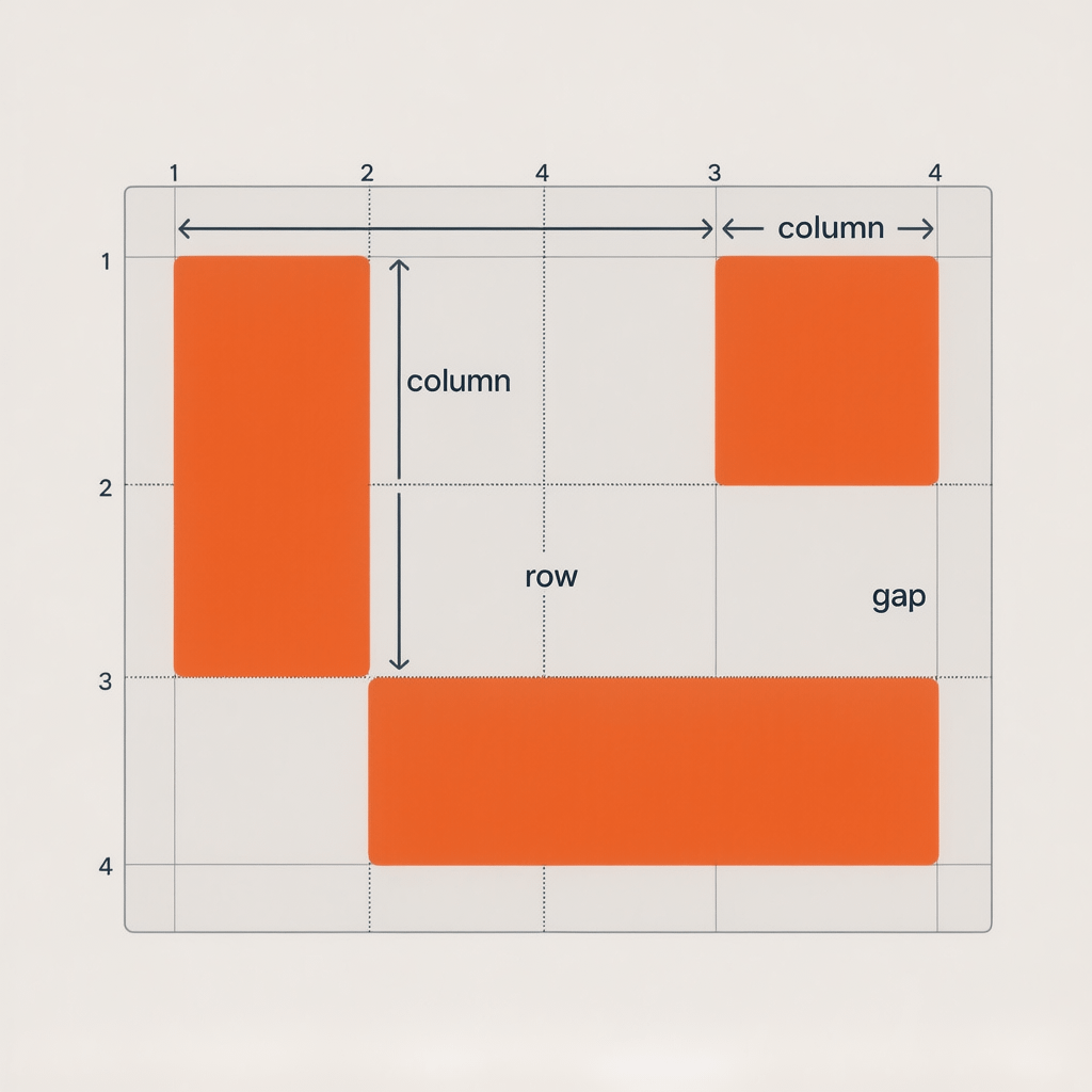
Core Concepts You Will Use All The Time
Before we write code, lock down the vocabulary. You will see these terms in devtools and documentation.
- Grid container: the element you set to display: grid.
- Grid items: direct children of the container.
- Tracks: columns and rows. You size them with grid-template-columns and grid-template-rows.
- Lines: the gutters between tracks. Lines have numbers and can have names.
- Areas: named rectangles made of tracks. They make templates readable.
- Gaps: spacing between items. Use gap instead of margins for consistent rhythm.
Once you can speak this language, everything in this how to use CSS grid for beginners tutorial clicks faster.
How to use CSS grid for beginners tutorial: step by step
Let us build layouts incrementally. You can copy each example into a single HTML file and refresh the browser.
1) Create a simple grid container
Start with minimal markup. Then turn the wrapper into a grid container. The browser will auto place items for you.
<style>
  .grid {
    display: grid;
    grid-template-columns: 1fr 1fr 1fr;
    gap: 1rem;
  }
  .grid > div { background: #f2f5f9; padding: 1rem; border: 1px solid #dbe2ea; }
</style>

<div class="grid">
  <div>A</div>
  <div>B</div>
  <div>C</div>
  <div>D</div>
  <div>E</div>
</div>
With three columns defined, items flow left to right, then wrap to the next row. This is the first win in our how to use CSS grid for beginners tutorial.
2) Use repeat and fr units
Typing 1fr three times is noisy. Use repeat to simplify and fr to share available space.
.grid {
  display: grid;
  grid-template-columns: repeat(3, 1fr);
  gap: 16px;
}
That is cleaner and scales well when you change the column count later.
3) Add responsive columns with minmax
Want cards to fit as many per row as the viewport allows without shrinking below a sensible minimum? Use auto-fit and minmax.
.grid {
  display: grid;
  grid-template-columns: repeat(auto-fit, minmax(220px, 1fr));
  gap: clamp(12px, 2vw, 24px);
}
This pattern appears throughout the how to use CSS grid for beginners tutorial because it solves real world responsive needs with one line.
4) Control spacing with gap
Use gap for consistent spacing between columns and rows. It avoids collapsed margins and weird edge cases.
.grid {
  gap: 1rem;         /* both axes */
  column-gap: 1rem;  /* horizontal only */
  row-gap: 1.25rem;  /* vertical only */
}
5) Place items by line numbers
Auto placement is great, but sometimes you want a hero to span columns. Place items precisely with grid-column and grid-row.
.hero { grid-column: 1 / 3; grid-row: 1; }
.sidebar { grid-column: 3; grid-row: 1 / 3; }
Line numbers read from left to right and top to bottom. You can also count from the end using negative numbers like -1.
6) Name lines for readability
Named lines make complex templates self documenting. You can refer to names instead of numbers.
.layout {
  display: grid;
  grid-template-columns: [full-start] 1fr [content-start] minmax(0, 720px) [content-end] 1fr [full-end];
}
.main {
  grid-column: content-start / content-end;
}
Names help when you return to code months later. This how to use CSS grid for beginners tutorial encourages naming whenever grids serve as page scaffolding.
7) Grid template areas for clarity
Areas let you draw a visual ASCII map. This is ideal for page sections like header, nav, main, aside, and footer.
.page {
  display: grid;
  grid-template-columns: 200px 1fr;
  grid-template-rows: auto 1fr auto;
  grid-template-areas:
    "header header"
    "nav    main"
    "footer footer";
  gap: 1rem;
}
header { grid-area: header; }
nav    { grid-area: nav; }
main   { grid-area: main; }
footer { grid-area: footer; }
8) Align like a pro with place items
Alignment is often a few properties away. Use place-items to set both axes at once, or use justify and align separately.
.grid     { place-items: start; }         /* align-items + justify-items */
.grid--center { place-items: center; }
.grid--end    { align-items: end; justify-items: center; }
9) Auto fit vs auto fill
Both pack in as many columns as possible, but auto-fit collapses empty tracks, while auto-fill preserves them. For most card grids, auto-fit is the friendlier choice.
.grid { grid-template-columns: repeat(auto-fit, minmax(240px, 1fr)); }Try both to feel the difference. This how to use CSS grid for beginners tutorial recommends auto-fit for elastic card layouts.
10) Build a responsive card grid
Put it together with practical markup and a few utility classes. This pattern works for product grids, blog cards, and galleries.
<section class="cards grid">
  <article class="card"><h4>Card 1</h4><p>Content</p></article>
  <article class="card"><h4>Card 2</h4><p>Content</p></article>
  <article class="card"><h4>Card 3</h4><p>Content</p></article>
</section>

<style>
.cards.grid { grid-template-columns: repeat(auto-fit, minmax(220px, 1fr)); gap: 1rem; }
.card { background: #fff; border: 1px solid #e5e9f2; border-radius: 8px; padding: 1rem; }
.card h4 { margin: 0 0 .5rem; font-size: 1.125rem; }
</style>
11) Two column content with sidebar
Make a stable two column layout that switches to one column on small screens without extra markup.
.content {
  display: grid;
  grid-template-columns: 280px 1fr;
  gap: 2rem;
}
@media (max-width: 900px) {
  .content { grid-template-columns: 1fr; }
}
Order your markup main first for accessibility and SEO. Place the sidebar visually with Grid so reading order stays logical.
12) Holy Grail layout in 30 lines
Header, nav, main, aside, footer. Grid areas make this classic layout easy and reliable.
.holy {
  display: grid;
  grid-template-columns: 1fr min(100ch, 1fr) 1fr;
  grid-template-areas:
    "header header header"
    ".      main    ."
    ".      aside   ."
    "footer footer footer";
  gap: 1.5rem;
}
header { grid-area: header; }
main   { grid-area: main; }
aside  { grid-area: aside; }
footer { grid-area: footer; }
Use min to control readable line length without complex media queries.
13) Masonry like layout with auto rows
While true masonry is not native in Grid, you can fake it with dense auto placement and small auto rows combined with row spans.
.masonry {
  display: grid;
  grid-auto-rows: 8px;
  grid-template-columns: repeat(auto-fit, minmax(240px, 1fr));
  gap: 12px;
  grid-auto-flow: row dense;
}
.masonry > .item--tall { grid-row: span 30; }
.masonry > .item--medium { grid-row: span 20; }
.masonry > .item--short { grid-row: span 10; }
This trick appears across galleries. It is a highlight inside our how to use CSS grid for beginners tutorial because it unlocks dynamic feeds with minimal code.
14) Subgrid for nested components
Subgrid keeps nested items aligned with the parent tracks. It is perfect for cards that need consistent inner columns.
.parent {
  display: grid;
  grid-template-columns: repeat(12, 1fr);
  gap: 1rem;
}
.card {
  grid-column: span 4;
  display: grid;
  grid-template-columns: subgrid;
  grid-column: span 4;
}
.card__meta { grid-column: 1 / 7; }
.card__cta  { grid-column: 7 / -1; }
15) Accessibility first
Grid does not change DOM order unless you force it. Keep meaningful content first, use landmarks like header, nav, main, and footer, and ensure focus states are visible.
- Preserve logical reading order and tab order.
- Use aria labels only when the native semantics are not clear.
- Prefer visible focus and sufficient color contrast.
16) Debug with devtools overlays
Every major browser ships Grid overlays. Toggle them, show line numbers, and watch how items snap to tracks as you change code.
- Name lines so overlays show helpful labels.
- Check the computed panel to confirm track sizes and gaps.
- Use outline: 1px dashed on grid items to see bounding boxes clearly.
17) Production checklists and fallbacks
Ship with confidence. Use targeted fallbacks and keep CSS small.
- Guard advanced features with @supports. Example: @supports(display: grid) { … }.
- Provide a simple one column or Flexbox fallback if needed.
- Minify CSS, purge unused utilities, and leverage HTTP caching headers.
- Compress images to WebP or AVIF and lazy load with loading=lazy.
These production habits make this how to use CSS grid for beginners tutorial practical for real sites, not just demos.
Flexbox vs Grid: choose the right tool
Use Flexbox for one dimensional alignment along a single axis. Use Grid when both axes matter and when you want precise placement controlled by the container.
In most projects, you combine them. For example, use Grid for page scaffolding, and use Flexbox inside cards for button alignment.

Real world patterns you can copy
These patterns are copy paste friendly and align with this how to use CSS grid for beginners tutorial. Swap colors and spacing to match your design system.
12 column responsive shell
.shell {
  display: grid;
  grid-template-columns: repeat(12, minmax(0, 1fr));
  gap: clamp(12px, 2vw, 24px);
  padding: clamp(16px, 3vw, 48px);
}
.col-12 { grid-column: span 12; }
.col-8  { grid-column: span 8; }
.col-4  { grid-column: span 4; }
@media (max-width: 900px) {
  .col-8, .col-4 { grid-column: span 12; }
}
Centered content with safe gutters
.container {
  display: grid;
  grid-template-columns:
    [full-start] minmax(16px, 1fr)
    [content-start] minmax(0, 1200px)
    [content-end] minmax(16px, 1fr)
    [full-end];
}
.container > * { grid-column: content-start / content-end; }
Sticky sidebar layout
.page {
  display: grid;
  grid-template-columns: 300px 1fr;
  gap: 2rem;
}
.sidebar { position: sticky; top: 1.25rem; height: max-content; }
Media object with grid
.media {
  display: grid;
  grid-template-columns: 72px 1fr;
  gap: 1rem;
  align-items: start;
}
.media__img { width: 72px; height: 72px; border-radius: 8px; }
.media__body { min-width: 0; }
Patterns like these show the breadth of options covered by this how to use CSS grid for beginners tutorial.
Page speed and CSS Grid performance
CSS Grid is fast. Performance problems usually come from images, scripts, or inefficient CSS. Keep your layout code lean and focus on asset optimization.
- Compress images with WebP or AVIF. Use a plugin to automate compression and lazy loading.
- Enable server and browser caching so returning visitors load instantly.
- Inline critical CSS for above the fold layout. Defer non critical styles.
- Prefer a single Grid over deep nested grids unless the design demands it.
If you want expert help with a fast, accessible build, the website design and development team at Brand Nexus Studios can assist with clean CSS, hosting, and performance tuning.
Common mistakes and how to avoid them
Even seasoned developers make these mistakes. Avoid them and you will ship layouts faster.
- Forgetting gap: Using margins between grid items leads to inconsistent spacing. Use gap for both axes.
- Over nesting: Two or three well designed grids beat a maze of wrappers.
- Hard coded widths: Prefer fr, minmax, and clamp for fluid sizing that adapts across screens.
- Ignoring DevTools: Grid overlays are your best friend. Toggle them early and often.
- Breaking reading order: Do not rely on visual placement to fix semantic order. Keep DOM order meaningful.
Bookmark this how to use CSS grid for beginners tutorial and come back whenever you hit a layout puzzle.
From tutorial to production
Move from learning to shipping by following a short process. It keeps your layout maintainable as the project grows.
- Sketch tracks: Decide how many columns and rows you need at key breakpoints.
- Name your lines: Content start and end make templates readable in a year.
- Define gaps: Set a rhythm that matches your spacing scale.
- Use tokens: Stick to spacing and color tokens to keep consistency.
- Document patterns: Save grids as snippets in your design system repo.
If your goal is better rankings and stronger content workflows for pages that use these layouts, our SEO services help turn structure into search visibility without bloat.
Practice project: landing page with CSS Grid
Let us build a small landing page to practice what this how to use CSS grid for beginners tutorial taught. You can use semantic HTML and a single stylesheet.
<header class="lp__header">Logo | Nav</header>
<main class="lp">
  <section class="hero">Hero</section>
  <section class="features grid">
    <article class="card">Feature A</article>
    <article class="card">Feature B</article>
    <article class="card">Feature C</article>
  </section>
  <section class="social-proof grid">
    <div class="quote">Customer quote</div>
    <div class="quote">Customer quote</div>
  </section>
  <section class="cta">CTA</section>
</main>
<footer class="lp__footer">Footer</footer>

<style>
  :root { --space: clamp(12px, 2vw, 24px); }
  .lp { display: grid; grid-template-columns: minmax(16px, 1fr) minmax(0, 1120px) minmax(16px, 1fr); }
  .lp > * { grid-column: 2; margin-bottom: var(--space); }
  .features.grid { grid-template-columns: repeat(auto-fit, minmax(280px, 1fr)); gap: var(--space); }
  .social-proof.grid { grid-template-columns: 1fr 1fr; gap: var(--space); }
  @media (max-width: 800px) { .social-proof.grid { grid-template-columns: 1fr; } }
</style>
This small page shows a complete flow from container to responsive sections using patterns from the how to use CSS grid for beginners tutorial.
Naming conventions that scale
Large projects benefit from predictable naming. Whether you use BEM, utility classes, or CSS Modules, pair names with Grid semantics.
- Use suffixes like .grid, .grid–center, .grid–12 for modifiers.
- Name areas semantically: header, nav, main, aside, footer.
- Name lines with start and end semantics rather than left and right for logical properties.
You will see this naming thread all through our how to use CSS grid for beginners tutorial because clarity compounds over time.
Working with content and marketing teams
Layout is only one part of the experience. Teams need components that accept real copy lengths, long headlines, and mixed media. Test with realistic content.
When you are ready to scale your content pipeline, content marketing services from Brand Nexus Studios can help you pair clean layouts with high performing copy and visuals.
Troubleshooting checklist
- Item is not spanning: check you are targeting the grid item, not a child of a child.
- Gaps look uneven: ensure you do not mix margins with gap unintentionally.
- Overflow hidden text: add minmax and minmax(0, 1fr) to ensure content can shrink properly.
- Alignment seems off: confirm justify and align are set at the right level, either container or item.
- Media queries fight the grid: you probably do not need as many breakpoints when using minmax and auto-fit.
Use this checklist alongside the how to use CSS grid for beginners tutorial to fix issues in minutes.
Copy and modify these utility classes
/* Quick utilities for common grid patterns */
.grid-2 { display: grid; grid-template-columns: repeat(2, 1fr); gap: 1rem; }
.grid-3 { display: grid; grid-template-columns: repeat(3, 1fr); gap: 1rem; }
.grid-4 { display: grid; grid-template-columns: repeat(4, 1fr); gap: 1rem; }
.grid-auto { display: grid; grid-template-columns: repeat(auto-fit, minmax(200px, 1fr)); gap: 1rem; }

.grid-center { place-items: center; }
.grid-stretch { align-items: stretch; justify-items: stretch; }

.line-clamp { display: -webkit-box; -webkit-line-clamp: 3; -webkit-box-orient: vertical; overflow: hidden; }
Utilities like these compress the code you write during this how to use CSS grid for beginners tutorial.
Quality assurance and handoff tips
Good handoff reduces churn. Share guardrails and notes with designers, copywriters, and QA so the layout holds up under stress.
- Document max character counts for headings and card titles.
- Define allowed image aspect ratios per module.
- Show how grids respond at small, medium, and large breakpoints.
- Include a fallback plan for old browsers and a checklist for visual regressions.
Use these notes to complement this how to use CSS grid for beginners tutorial during sprint reviews.
Next steps and further study
You are now comfortable with the basics. Continue by building a dashboard, a blog homepage, or a portfolio gallery using the patterns above.
Revisit this how to use CSS grid for beginners tutorial as a reference. Each section stands on its own, so you can jump straight to the pattern you need.
FAQs
Is CSS Grid better than Flexbox for page layout?
Grid is better for two dimensional layouts where rows and columns matter together. Flexbox shines for one dimensional alignment. Many teams mix both approaches.
What browsers support CSS Grid in 2025?
All evergreen browsers support Grid, with subgrid available in modern versions. Use @supports to add fallbacks where needed.
How do I make a responsive grid in one line?
Use repeat with auto-fit and minmax: grid-template-columns: repeat(auto-fit, minmax(220px, 1fr)); It is the star of this how to use CSS grid for beginners tutorial.
How can I overlap items cleanly?
Place multiple items in the same cell or range and use z-index for stacking. This avoids manual positioning with top and left.
What is subgrid again?
Subgrid lets child elements inherit their parent grid track sizing so inner components align perfectly without guessing column widths.
How do I debug grids quickly?
Turn on Grid overlays in DevTools, name lines so overlays display labels, and test changes in the computed panel to watch track sizes update.
How do I keep layouts fast?
Compress and lazy load images, cache aggressively, and ship minimal CSS. Grid itself is performant, so focus on assets and structure.
References
For deeper reading after completing this how to use CSS grid for beginners tutorial, consult the official specs and comprehensive docs below.
About the Author